Chart Similarities
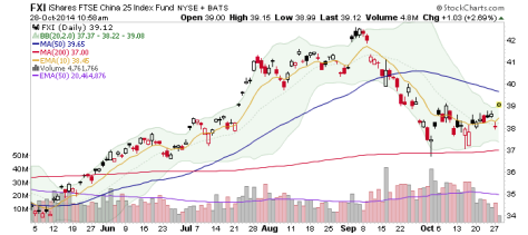
We have been noting in NFTRH Key ETF Updates that the China 25 ETF looked somewhat bullish by daily chart. I went ahead and bought it because it looked bullish in early 2014 too (Inverted H&S by weekly chart) and that was a good trade, even though I didn’t know why it was bullish (macro markets sure weren’t at the time).
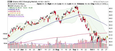
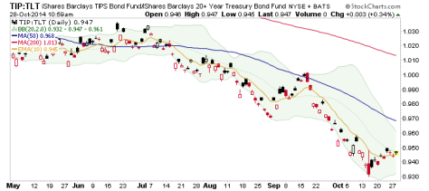
Well, yesterday FXI made me look silly as it tanked. Today it is making me look okay. Of more importance than what I look like is that FXI, EEM (Emerging Markets) and the TIP-TLT ratio all have similar (sort of) patterns. What’s it mean with respect to Uncle Buck?
Disclosure: None.
Comments
Please wait...
Comment posted successfully.
No Thumbs up yet!


