More Choppiness Ahead? – Weekly Market Outlook
Technically speaking, the market made gains last week. What the bottom-line number doesn't indicate, however, is how much of a struggle it was to even manage that modest advance. In fact, it looked like the bulls were out of gas by mid-day Friday, and were yielding to the bears again.
Was that just a pre-weekend lull, and will the buyers come back to the table – hungry – this week and finally get the market past a major hurdle? Or, was Friday's pullback an omen of yet another pullback on the way? We'll weigh the odds right after we slice and dice last week's major economic numbers.
Economic Calendar
While last week's economic-data dance card was pretty full, there's no doubt as to the focal point for the week…. April's employment/unemployment data, which came out on Friday.
We should have known a good-sized jump job creation was a possibility following the strong growth figure from payroll processor ADP on Wednesday. ADP reported new 220,000 positions were added last month, up from March's 209,000 and better than the estimated 215,000 new payrolls. But, the ADP number didn't even come close to describing the degree of the increase we got in the official jobs-growth number from the government. The Department of Labor said we added 288,000 new payrolls last month, topping March's increase of 203,000, and trouncing estimates for an increase of 210,000.
Given that strong improvement, it's no surprise that the unemployment rate measurably fell, from 6.6% to 6.3%. Yet, even with 288,000 new payrolls added in April, a 30 basis point plunge in the unemployment rate is big… to the point of being odd. How'd we muster such a leap?
Well, as it turns out, the big dip in the unemployment rate was more the result of fortuitous math than it was actual progress. Last month, a little more than 800,000 people were removed from the labor force (voluntarily or not). The portion of people in the labor force that don't have jobs – aka "the unemployed" – fell a similar 733,000… but not necessarily because they found jobs. Indeed, most of them did NOT find jobs; they may have simply seen their unemployment benefits expire but have also given up on trying to find a job. Either way, while the unemployment rate fell sharply, actual employment did NOT improve. The number of people who have jobs actually fell (on a seasonally adjusted basis) in April.
Employment Trends Chart
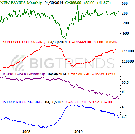
Source: Department of Labor
As fir everything else, it was a mixed bag last week. Factory orders were up 1.1% in March, and the Chicago PMI score grew from 55.9 to 63.0. On the flipside, consumer confidence slid from 83.9 to 82.3 for April (which is still a solid score), while the first quarter's GDP growth rate rolled in at a pitiful 0.1%, falling well short of the expected 1.0% increase. Bad weather can't get all the blame for a GDP contraction of that size.
Consumer Confidence Chart
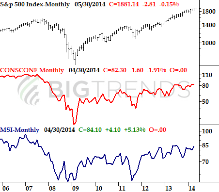
Source: Reuters, University of Michigan, and Conference Board
Everything else is on the following grid:
Economic Calendar

Source: Briefing.com
This week is clearly going to be a much lighter week. In fact, none of this week's data could be considered a heavy-hitter in terms of being able to move the market.
Stock Market Index Analysis
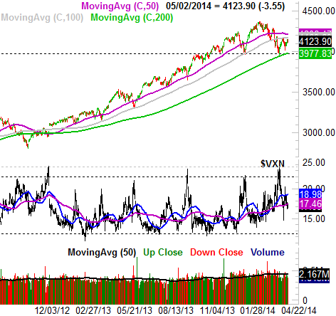
With just a quick glance at the weekly chart of the S&P 500 (SPX) (SPY), things look reasonably bullish…. not wildly bullish, but decent. The index made a gain last week, and remains in a broad uptrend, supported by a rising support line (dashed). Take a look.
S&P 500 & VIX – Weekly Chart
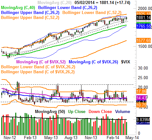
All charts created with TradeStation
The longer you study the S&P 500's long-term chart, however, the clearer it becomes that stocks are struggling now more than they had up until early March. Now, the index isn't even able to push the upper 26-week Bollinger band upward, and despite several attempts, the SPX has been completely unable to get above – and stay above – the recent ceiling at 1885.
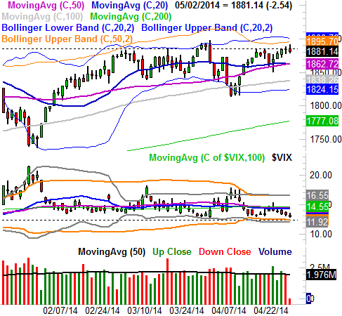
Point being, we may or may not still be in an uptrend. Traders seem to be giving stocks the benefit of the doubt, but when you zoom into a daily chart of the S&P 500, that's getting tougher and tougher to do. It's in the daily timeframe we can see just how big of a problem that resistance at 1885 is; the S&P 500 was already slowing down as it moved into the 1885 level. Throw in the fact that the CBOE Volatility Index (VIX) (VXX) is once again on the verge of hitting a major floor at 12.30 (also dashed), and the deck is stacked against the bulls.
S&P 500 & VIX – Daily Chart
The picture doesn't get any clearer when we look at a chart of the NASDAQ Composite. In fact, the NASDAQ looks like it's even more trapped between a rock and a hard place. The floor is still the 200-day moving average line (green), while the ceiling is still the converged 50-day (purple) and 100-day (gray) moving average lines. Until one of those confines is broken, the market could go either way.
NASDAQ Composite & VXN – Weekly Chart
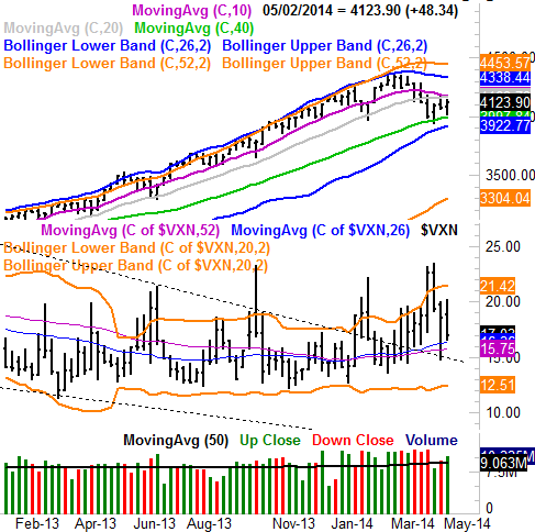
Nothing really changes when you zoom into the daily chart of the NASDAQ Composite (COMP) (QQQ). The daily chart of the NASDAQ does throw us a curve ball when the Nasdaq Volatility Index (VXN) is considered, however.
The Composite hit a major peak around 22.5 in mid-April, which has historically coincided with a pretty meaningful low for the NASDAQ. The composite did bounce a little this time around, and the VXN still has room to move lower (and is currently trending lower). That's bullish for stocks, although the composite has yet to clear its major ceilings around 4190.
NASDAQ Comp & VXN - Daily Chart
So what's the verdict? There isn't one… at least not yet. We may well have a clear verdict by the end of this week, however.
While the market may be caught between a rock and a hard place right now – and has been for a while – traders tend not to let stocks sit stagnant for very long. This week may well be the week that bored traders decide it's time to make a move. The bullish/bearish odds are right around 50/50, but once we get a breakout or a breakdown started (outside of the current support and resistance zone), we'll likely keep rolling in that direction for a while. The best move here may be keeping your powder dry until one side of the table or the other commits, and then follow that lead. Anything less, and it may just be more choppiness.
Trade Well,
Price Headley
BigTrends.com
1-800-244-8736