
This Post Is For Those Who Think Consumer Income Is Improving Or Declining
Written by Steven Hansen
My analysis of personal income and expenditures last week was mixed depending on whether you were looking in the short term or the long term. In the short term, consumer spending is definitely decelerating - which is a negative dynamic to GDP. On the other hand, consumer income's growth continued to outpace expenditures - which should translate in the ability of consumers at some point in the future to increase spending.

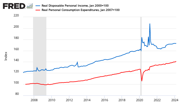
The graph below illustrates the relationship between income (disposable personal income - DPI) and expenditures (personal consumption expenditures - PCE) – showing that income and expenditures grow at nearly the same rate over time. Incomes are now growing faster than consumer expenditures – and this is positive for long term economic growth (as future spending is being banked).
Indexed to Jan 2000, Growth of Real Disposable Income (blue line) to Real Expenditures (red line)
Consider that one reason consumer spending is currently constrained is that consumers are still spending a historically high proportion of their income - although this ratio is now trending back towards historically normal values.
Seasonally Adjusted Spending’s Ratio to Income (a declining ratio means consumer is spending less of its Income)

Here is a look at the rate of growth of real disposable income growth on a year-over-year basis which shows consumer income growth is about average for the 21st century in times of "economic expansion" - and there is no identifiable trend up or down - although it may have a slightly positive growth bias in 2014.

And here is the same data showing per capita growth rates which show little difference in the trends.

The following graph appeared in a Business Insider newsletter with a quote proclaiming:
"The acceleration in wages is not really a surprise given how tight the labor market is, see also all the work we have done on this topic in recent months," Deustche Bank's Torsten Slok said. "The wage acceleration we are seeing tells us that the NAIRU in the US economy is around 5.9%. Fixed income investors should be paying attention to the rising trend in wages because the FOMC will not be ignoring it. In other words, it is time to protect your portfolio against higher rates."

The Business Insider graph above uses BLS data - and my post so far has been using Bureau of Economic Analysis (BEA) data. Yet both could be accurate as the BEA data includes everyone in the economy - including self employed and non-wage income - whilst the BLS data is only a subset (wages and salaries). However the above graph used annualized data (growth over previous period extrapolated like it was a year's worth of data):
- if the previous period was a distortion, the next period appears overly strong or overly weak;
- when looking at seasonally adjusted data, any small error in the seasonal adjustment factor multiplies the error if you annualize a period of data against the previous period of data. The annualized data we are fed in many of the headlines (such as GDP) can be very misleading. A better way is to look at year-over-year trends.
For grins, here is a similar data set from the BEA showing year-over-year growth. [Note that I tend to favor the BEA when it comes to data gathering, analysis and methodology. The annualized graph of BEA wage and salary increases is here - and it tells a very different story than the graph in the Business Insider post.]

But the message from Business Insider was not about wages - "Fixed income investors should be paying attention to the rising trend in wages because the FOMC will not be ignoring it. In other words, it is time to protect your portfolio against higher rates".
When the FOMC cut off QE portfolio growth last week, one of the primary reasons given was improvement in employment (specifically the unemployment rate). Most of us (including the FOMC) realize employment is moderately improving, but the fairly large decline in the unemployment rate exaggerates the improvement in employment situation. The real reason for ending QE is that the FOMC saw little benefit to continuing QE. The FOMC could never admit that QE was not benefiting the economy.
Now comes their zero interest rate policy (ZIRP). There are dangers in artificially depressing interest rates for long periods of time - the Japanese effect for one. Rising wages may be the excuse to raising interest rates. Hey, whatever works ....
Other Economic News this Week:
The Econintersect Economic Index for November 2014 is showing our index on the low side of a tight growth range for almost a year. Although there are no warning flags in the data which is used to compile our forecast, there also is no signs that the rate of economic growth will improve. Additionally there are no warning signs in other leading indices that the economy is stalling - EXCEPT ECRI's Weekly Leading Index at the zero growth line.
The ECRI WLI growth index value crossed slightly into negative territory which implies the economy will not have grown six months from today.
Current ECRI WLI Growth Index

The market was expecting the weekly initial unemployment claims at 280,000 to 290,000 (consensus 283,000) vs the 278,000 reported. The more important (because of the volatility in the weekly reported claims and seasonality errors in adjusting the data) 4 week moving average moved from 281,250 (reported last week as 281,000) to 279,000.
Weekly Initial Unemployment Claims - 4 Week Average - Seasonally Adjusted - 2011 (red line), 2012 (green line), 2013 (blue line), 2014 (orange line)

/images/z unemployment.PNG
Bankruptcies this Week: Privately-held Marion Energy, UniTek Global Services
Disclosure: None.


