
No Snapback Rally & A Rising VIX – Weekly Market Outlook
The good news is, last week's weakness wasn't as harsh as the big pullback from two weeks ago was. The bad news is, it's not like the market snapped back into rally mode. All told, the S&P 500 (SPX) (SPY) fell another 0.4%, with the bulls not nibbling on the "undervalued" or the "oversold" bait. The fact that the market didn't bounce back from a horrible week the week before says a lot how anemic this market has become now. And, there's another clue that says the undertow may have already shifted from bullish to bearish.
We'll look at that change in a moment, after a quick recap of last week's and this week's economic data.
Economic Calendar
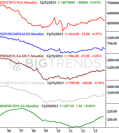
It was a fairly busy week last week in terms of economic numbers, though not much of it was overly important. One of the bigger data points was on the real estate front; new home sales sold at a pace of 414,000 in December, down from the November pace of 445,000. Pending home sales fell 8.7% for December as well. The two data sets wrap up a somewhat concerning though not-yet-alarming round of real estate and construction data. It's too soon to assume the worst yet, but things are not red hot like they have been the last couple of years.
Real Estate and Construction Data Chart
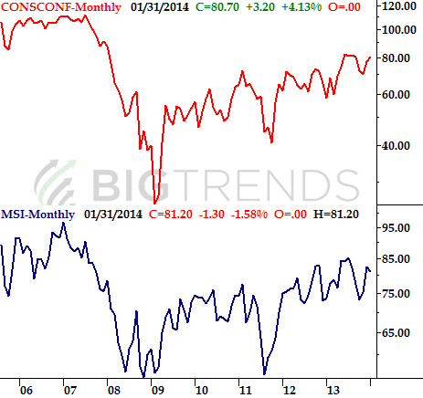
While interesting housing and real estate may have hit a lull, consumers are still feeling good about things overall. The Conference Board's consumer confidence reading rose from 77.5 to 80.7, while the Michigan Sentiment Index was up from December's score of 80.4 to 81.2 for January.
Consumer Confidence Chart
Finally, economists knew it would be a good number, but they still underestimated just how good it would be. Looking for annualized growth of 3.0%, fourth quarter's GDP improvement rolled in at 3.2%. That's the second quarter on a row of really big growth.
Economic Calendar
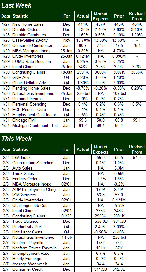
This week is going to be a little busier, though once again, not a great deal of the data we'll be getting is all that important. There is one piece of data in the lineup that's immensely important, however, and that's January's unemployment rate. For December we saw a drastic plunge from 7.0% to 6.7%, though the scope of the decline was exaggerated because of the way the figure is calculated. Economists are looking for no change there.
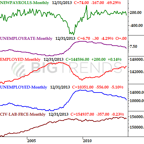
Also, in the same vein, the pros expect the government to say the economy added 175,000 new jobs last month, up from December's woefully low 74,000 new jobs created. The expectation jives with the 178,000 jobs ADP is forecasted to saw were created last month. Either way – and despite the critics – we are seeing progress on the employment front, even if it is slow.
Employment Chart
Stock Market Index Analysis
As was already noted above, the market didn't lose much ground last week, but it sure didn't gain any ground either. It's the first time in a long time stocks didn't rally back in a hurry after a major setback. That's alarming. Still, there's a bastion of hope for the bulls.
Let's start small with our index analysis this week, and then zoom out to the bigger picture. In other words, let's get things started with a look at the daily chart.
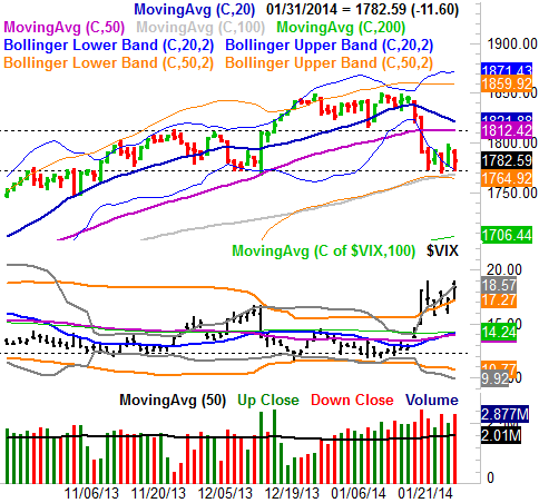
First and foremost, a MAJOR support line has developed for the S&P 500. The 1772 level is not only where the index found a floor all last week, but that's also where the index found a floor in mid-December. It was also a major ceiling back in early November, so clearly it's a meaningful level. As long as the S&P 500 can hold above that level, the bulls are still technically in the hunt. It's also worth noting how the lower 50-day Bollinger band (orange) and the 100-day moving average line (gray) have converged at 1765 to form what will likely be a floor in the near future too, should the 1772 level fail. Take a look:
S&P 500 & VIX – Daily Chart
There's a flipside to that coin, however. A couple of things may be telling us it's only a matter of time before the floor at 1772 snaps and opens the selling floodgates.
The first one is the rising CBOE Volatility Index (VIX) (VXX). Though we've seen the VIX move higher before, it's been a while since we've seen it behave like this. Now, the VIX has had little problem moving up and above its upper band lines… even with the market itself was stagnant, as it was last week.
The other red flag is the fact that the three bearish days for last week were the highest volume days last week, and the two bullish days were the lowest volume days of last week. It's a pretty clear sign there are more sellers than buyers at this point.
So what changes when you take a step back and look at a weekly chart of the S&P 500? Not a lot. It does add a lot of perspective, however. For instance, the importance of the floor around 1772 becomes even clearer when you realize that's also where the S&P 500's long-term rising support line (black) is currently resting. If the index breaks under that floor, it'll be the first time in more than two years since it's happened, underscoring the idea that it even a small dip from here would be a major paradigm shift for the market.
S&P 500 & VIX – Weekly Chart
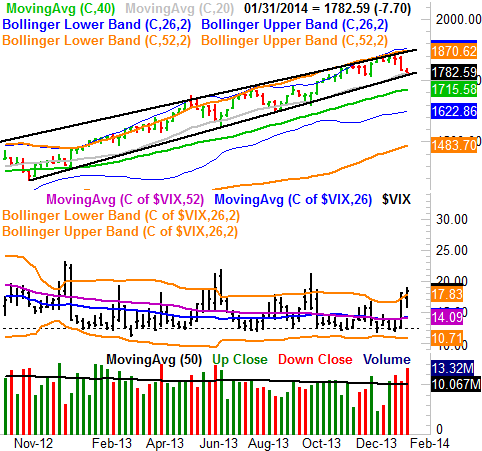
It's also on the weekly chart we can see how bearish the volume got last week, and more than that we can see how the VIX truly wants to – or wanted to – move higher as of last week. Last week was the second week in a row the VIX closed above its upper 26-week Bollinger band. It's the first time since mid-2011 we've seen it happen, suggesting the recent weakness from the market isn't just a little volatility. It's a fairly organized and fairly well-reasoned effort, which is why it's scary.
There's no need to panic yet, but just a little more weakness would be a reason to worry, as that could pull the market under a key technical floor. At the other end of the spectrum, there's no need to start getting optimistic again unless the S&P 500 can work its way back above the 1812 level. That was a big ceiling back in December, and it's where the 50-day moving average line (purple). It's also where the 20-day moving average line will be soon. All have the potential to act as resistance, but together, that potential is augmented.
None.


