
9 Weeks (And Counting) Of Treading Water – Weekly Market Outlook
Part of the market's current stagnation can be chalked up to the time of year… the coming summer doldrums. Another part of it, however, stems from the fact that traders are simply unsure of what to think here. The good news is, the floors and ceilings are pretty clear. The challenge is, there's no particular guarantee we'll move past either this week.
We'll dissect the details in a moment. Let's first paint the bigger economic picture.
Economic Calendar
There wasn't much economic data in the lineup last week, and none of the little that we got was market-moving… or even interesting. There's not even any need to commentary about. Just take a look at the calendar:
Economic Calendar
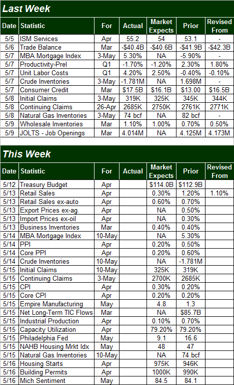
Source: Briefing.com
This week, however, will more than make up for last week in terms of economic data… and then some. A few of these data nuggets will need to be discussed before we hear the most recent round of numbers.
The fireworks start in earnest on Tuesday, with retail sales for April. It's unlikely we'll match March's big bump, but the pros say we should see decent growth again. Look for a 0.3% increase with automobiles, and a 0.6% improvement when taking cars out of the picture.
It's also going to be a big week for inflation data; we'll be hearing producer as well as consumer inflation rates. Both have been plenty tame lately… perhaps a little too tame. It's a hint that pricing power remains tepid, which is a hint that consumers aren't feeling spend-happy. We really need to see both inflation rates steady above 2.0% to be able to say the economy is healthy enough to stand on its own.
Annualized Inflation (Consumer & Producer) Chart
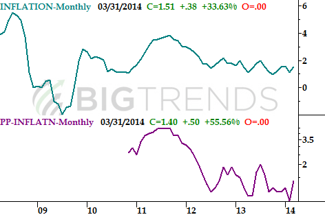
Source: Bureau of Labor Statistics
We're also going to get a big dose of factory activity data on Thursday – perhaps the most important snapshot of industrial activity – when April's Industrial Productivity Index and Capacity Utilization figures are unveiled. Both have been in fairly impressive uptrends since 2009, keeping the long-term bull market alive. The increased factory activity won't stave off any short-term pullbacks, but it's a good sign for buy-and-hold investors.
Capacity Utilization and Industrial Productivity Chart
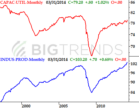
Source: Federal Reserve
Finally, we're going start a wave of real estate and construction data this week when we hear April's housing starts and building permits on Friday. We haven't been getting great numbers on either front lately; the uptrends that have been in place since 2011 are stagnating. It's not just starts and permits that are weakening, however – we're seeing slow-downs for almost all of the related data sets. While the broad economy can survive the status quo on the real estate and housing front, it may not survive a deterioration of these trends.
Real Estate, Housing, and Construction Trends Chart
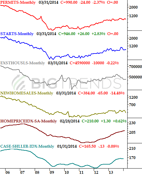
Source: FHFA. Standard & Poor's, Census Bureau, and National Assn. of Realtors
While not red hot, the economy remains in decent shape. Real estate is a concern, but not yet a liability. Productivity and utilization are the biggies for the long haul, and we continue to see progress there.
Stock Market Index Analysis
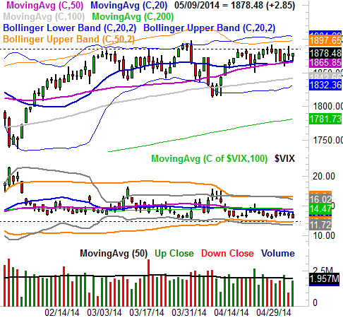
If it feels like the market is just spinning its wheels, you're not crazy – that's what's happening. The S&P 500 (SPX) (SPY) closed on Friday right around where it closed nine weeks ago. Yes, we've got a problem… a ton of persistent resistance. That ceiling is at 1885 (dashed). We brushed it a couple of times last week, as we have a few times since early March. Each time we touch it though, the bears pull the rug out from underneath the effort.
S&P 500 & VIX – Daily Chart
All charts created with TradeStation
While annoying, it's not a reason to assume the worst. At the same time the S&P 500 seems stuck under a major ceiling, it's also finding support at the converged 20-day and 50-day moving average lines at 1866. That's relatively new, meaning we've not seen the index find a floor at either of those lines in a while. Overlapping, however, they may have enough strength to act as a floor.
The end result is a market that's caught between a rock and a hard place. Moreover, the odds of a breakout are about the same as the odds of a breakdown. It really is a matter of which side of the table flinches first.
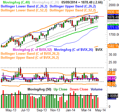
Nothing really changes when we zoom out to a weekly chart – we can still see the ceiling at 1885, yet we can also see there's lots of (rising) support in this timeframe too. Something else we can see on the weekly chart… a CBOE Volatility Index (VIX) (VXX) that's at rock-bottom levels, and apparently unwilling to move below a support level around 12.4. It wouldn't be completely impossible for the market to move upward while the VIX is this low, it would be enormously difficult. Adding to the market's potential stagnation is the fact that we're now in the slowest (non-moving) time of year for stocks.
S&P 500 & VIX – Weekly Chart
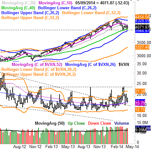
Point being, while things may not look great for the S&P 500, they don't look bad either – the bulls still seem to have a chance of rekindling the uptrend that had been in place through February. Ditto for the Dow Industrials (INDU) (DIA). When one looks at the chart of the NASDAQ Composite (COMP) (QQQ), however, much of that hope deflates.
Starting with the weekly view of the composite, the index broke under a key support level – the 100-day moving average line (gray) – in early April after it had found support at that level many times since early 2013. The NASDAQ has yet to move back above that level. In fact, the index is still putting a ton of pressure on the 200-day moving average line (green) as a floor. The horizontal level of 3970 is also a key floor. While a move under those two levels would be needed to push the composite past the point of no return, the bears haven't yet been able to deal blow that brutal. Until that happens, the bulls still have a fighting chance, even if the odds remain slightly more bearish here than they do with the S&P 500.
NASDAQ Composite & VXN – Weekly Chart
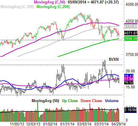
Not much changes when you zoom into the daily chart of the NASDAQ Composite, though in this timeframe we can see how the index is about to get squeezed real tightly between support and resistance. It's also on the daily chart that we can see the composite's 50-day moving average line (purple) is about to move under the 100-day moving average line (gray). If it does, it would be the first time the 50-day average has been below the 100-day line since January 2013. In the shadow of the 37% rally between then and now, that bearish crossunder could signal something of a bearish paradigm shift.
NASDAQ & VXN – Daily Chart
Bottom line? The market's at an inflection point. As much as we'd like to be able to say stocks will finally make a decision this week and than actually start to make a meaningful move in that direction, the reality is, it may not actually happen this week. We know where the lines in the sand are, however… the cues. Just keep and eye on those support and resistance levels.
Trade Well,
Price Headley
None.


