
Finally, Some Economic Growth!
The Bureau of Economic Analysis announced today that U.S. real GDP grew at a 4.0% annual rate in the second quarter. Hopefully that’s the start of something good; but so far, it’s only a start.
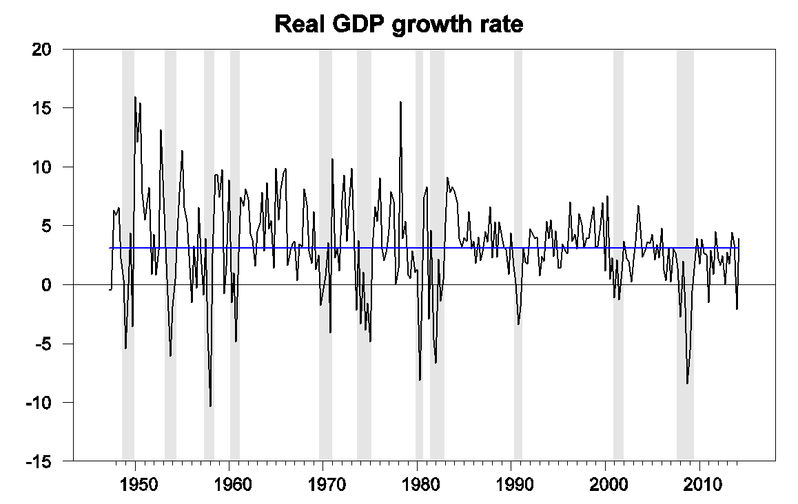
U.S. real GDP growth at an annual rate, 1947:Q2-2014:Q2. Blue horizontal line is drawn at the historical average (3.1%).
In part, the growth from Q1 to Q2 looked good because the level for Q1 was so bad. True, the BEA’s new estimate of Q1 growth (a 2.1% drop at an annual rate) was a little improvement over the -2.9% figure the BEA announced last month. But the revised estimates still imply a pathetic annual growth rate below 1% for the first half of the year. And true also, the BEA revised up the estimates for 2013, so that the last 4 quarters clocked a more respectable average growth rate of 2.5%. But upward revisions to 2013 came at the expense of downward revisions to 2011 and 2012– we seem to be always borrowing from Peter to pay Paul.
Source: Council of Economic Advisers.
Our Econbrowser Recession Indicator Index, which uses today’s data release to form a picture of where the economy stood as of the end of 2014:Q1, jumped up to 24.1%, reflecting the sharp drop in GDP in the first quarter. Our policy of always waiting one quarter for data revisions and trend recognition before calculating the index is looking particularly wise given the roller coaster ride the BEA has put us through in their different versions of the 2014:Q1 estimates. And our index, unlike the BEA figures, is never revised. According to our gauge, the Q1 drop and slow first half growth were disturbing, but not the start of a recession– our indicator would have to rise to 67% before we would declare that a new recession had begun.
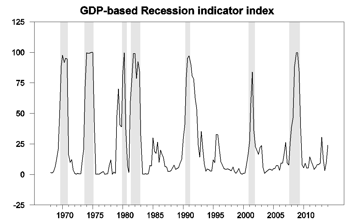
GDP-based recession indicator index. The plotted value for each date is based solely on information as it would have been publicly available and reported as of one quarter after the indicated date, with 2014:Q1 the last date shown on the graph. Shaded regions represent the NBER’s dates for recessions, which dates were not used in any way in constructing the index, and which were sometimes not reported until two years after the date.
In terms of the individual components behind the Q2 GDP growth, the positive contributions of investment and exports are certainly encouraging. But 1.7 percentage points of the 4.0% growth came from inventory build-up, representing goods that need to find buyers in the future– perhaps borrowing more from Peter again.
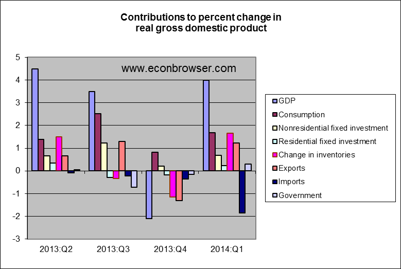
And the White House was unusually candid in warning us that BEA has essentially no idea based on data available so far about what happened to real health care services (which account for about a sixth of total consumption spending) during the second quarter. Indeed, the BEA’s estimates of real health care services in their first announcement for a given quarter (like the one we just received) turn out to be negatively correlated with the estimate for the same quarter that they will announce two months later.
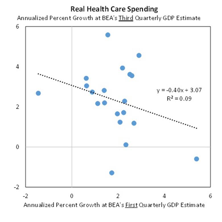
Source: Council of Economic Advisers.
Notwithstanding, this could finally be the start of a string of encouraging GDP numbers that many of us have been expecting for some time. The always-to-be-trusted Bill McBride notes that state-and-local government spending, which had put a persistent drag on the economy over 2010-2012, has finally turned around. And certainly there is potential for a bigger contribution from residential fixed investment.
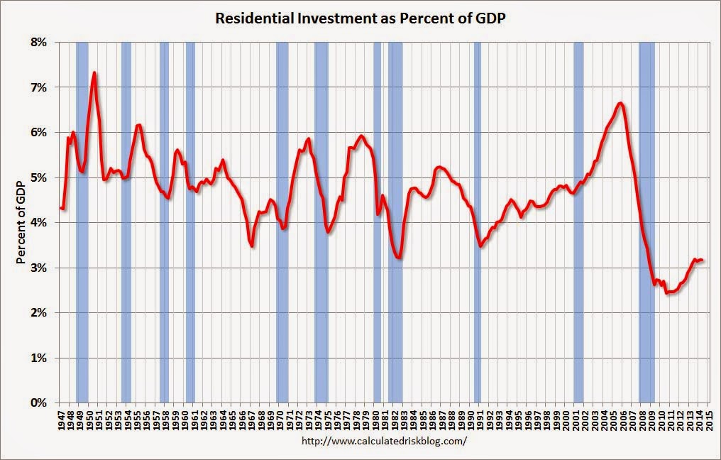
Source: Calculated Risk.
So maybe we’re in for a string of good news. But like I say, so far, it’s only a start.
Disclosure: None.


