Housing Recovery Is An Illusion While Housing Inflation Rages
Courtesy of Lee Adler of the Wall Street Examiner
First time unemployment claims data has been extremely strong in recent weeks. The government and pundits (including yours truly) blamed an undercount of claimants due to software upgrades in two states. The scuttlebutt was that not all claims had been reported.
But subsequent weekly adjustments to the data have been no greater than normal. The big declines in claims appear to be real. The data is supported independently by the real time Federal Withholding Tax data reported by the Treasury Department. All of which leads to the question, ”Is the economy overheating and the Fed doesn’t know it?”
The Labor Department reported that in the week ending September 21, the advance figure for seasonally adjusted initial claims was 305,000, a decrease of 5,000 from the previous week’s revised figure of 310,000. The 4-week moving average was 308,000, a decrease of 7,000 from the previous week’s revised average of 315,000. The consensus estimate of economists of 325,000 for the SA headline number was way too high (see footnote 1) as economists remain too pessimistic and apparently unwilling to pay heed to the real-time hard data on Federal Withholding taxes, which I track weekly in the Treasury Update.
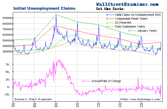
The headline seasonally adjusted data is the only data the media reports but the Department of Labor (DOL) also reports the actual data, not seasonally adjusted (NSA). The DOL said in the current press release, “The advance number of actual initial claims under state programs, unadjusted, totaled 253,668 in the week ending September 21, a decrease of 19,250 from the previous week. There were 303,685 initial claims in the comparable week in 2012.” [Added emphasis mine] See footnote 2.
The actual filings last week represented a decrease of 16.5% versus the corresponding week last year. Excluding the last two weeks when the DOL reported that not all state claims had been counted due to software upgrades in a couple of states, this week’s annual rate of change is the largest decline since early 2012 (excluding weeks skewed by Superstorm Sandy).
There’s usually significant volatility in this number. The current number is within the usual range of the past two years of from zero to -20%. Excluding the last two weeks, over the prior 2 months the rate of decline was -10% to -13%. The average weekly year to year improvement of the past 2 years is -8.4%. Any way you slice it, this week’s reading was exceptionally strong. In fact, claims as a percentage of the total employed are now at levels last seen at the end of the housing bubble, just before the market and economy collapsed.
But this time is different. Really. In 2007, the Fed had stopped growing its balance sheet and later in the year it began withdrawing cash from the System Open Market Account (SOMA) in order to sterilize the earliest of its emergency alphabet soup panic programs, the TAF. The Fed wanted to hold its total assets flat. In the process it starved the Primary Dealers of their usual funding, which led to the market crash.
The current conditions are vastly different, as the Fed threw a tantrum last week and refused to reduce even one dime of the $110 billion per month (gross including MBS replacement purchases) that it is pumping into Primary Dealer accounts. No doubt initial claims will go even lower as a result. That’s not to say that good jobs are being created or that this can be sustained indefinitely. It’s just that it’s continuing for the time being and will probably continue to continue until “something happens.”
Apparently the reports of a significant undercount due to the software changes in two states were bogus. The advance weekly report on first time claims is usually revised up by from 1,000 to 4,000 in the following week when all interstate claims have been counted. Last week’s number was adjusted up by 1,500, so the reported undercount wasn’t significant. In fact, the week before when the undercount was supposedly large, the subsequent upward revision was only 1,100. The year to year decline in the September 12 week really may have been near 23.5% as I reported at the time. I viewed the number skeptically, but subsequent data supports it.
Given the low level of claims and the sharp year to year declines, is it possible that the economy is overheating, and that the Fed is unaware? It would require a suspension of disbelief, but that’s what this data suggests.
I adjusted this week’s reported number up by 1,500 to 255,000 after rounding. Normally it does not matter that it’s a thousand or two either way in the final count the following week. The differences are essentially rounding errors, invisible on the chart.
After adjustment and rounding, the current weekly change in the NSA initial claims number is a drop of 18,000 from the previous week. That compares with a drop of 27,000 for the comparable week last year, which was exceptionally strong. The average change for the comparable week over the prior 10 years was -4,500. There was probably some giveback this week from the extremely strong changes of the past two weeks.
The Federal withholding tax data was very strong for the two prior weeks, supporting the reported changes in claims, and although it softened, it was still on trend for the latest week. I had reported two weeks ago that I suspected that the claims number would have been pretty strong in any case. The reported numbers are consistent with the withholding tax data. It had a strong uptick in August followed by only slight softening in September, a sign that the economy is growing at about the same rate it has been for the past year.
To signal a weakening economy, current weekly claims would need to be greater than the comparable week last year. That hasn’t happened yet. The trend has been one of steady improvement. The fact that recent weeks have been down from last year as much as they have been is extraordinary given that these comparisons are now much tougher than in the early years of the 2009-13 rebound.
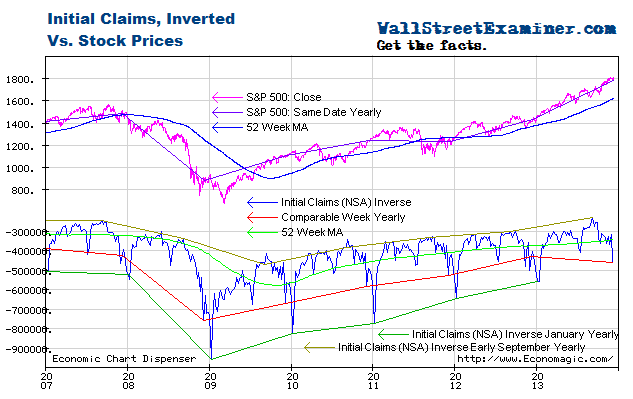
Relative to the trends indicated by unemployment claim, stocks have been extended and vulnerable since May. QE has pushed stock prices higher but has done nothing to stimulate jobs growth. The last few weeks notwithstanding, the rate of change in claims hadn’t changed much since 2011 whether the QE spigot was turned on or turned off.
Given the recent strength in this data, the Fed could have used it as an excuse for tapering QE, but like a spoiled child, it simply closed its eyes, threw a tantrum, and held tight to its money printing, regardless of the facts.
I plot the claims trend on an inverse scale on the chart below with stock prices on a normal scale. The acceleration of stock prices in the first half of 2013 suggested that bubble dynamics were at work in the equities market, thanks to the Fed’s money printing. Those dynamics appeared to have ended in July but the zombie keeps coming back to life, this time in a third drive toward the upper trendline. Tapering by the Fed would probably make the environment for stocks less friendly, but when bubbles enter their final runaway blowoff stage it usually takes more than a little tapping on the brakes to stop them. I address the specific potential outcomes in my proprietary technical work.
Get regular updates the machinations of the Fed, Treasury, Primary Dealers and foreign central banks in the US market, in the Fed Report in the Professional Edition, Money Liquidity, and Real Estate Package. Click this link to try WSE's Professional Edition risk free for 30 days!
Copyright © 2012 The Wall Street Examiner. All Rights Reserved. The above may be reposted with attribution and a prominent link to the Wall Street Examiner.


