
Important Point For Rally Attempt
A few charts can illustrate the “improving, but still tenuous” state of the current rally attempt in the stock market. The S&P 500’s weekly chart as of last Friday can be seen here; it has shown some improvement this week (see below), but the gains could be “erased” before the end of the week. Weekly charts print one number each week; the close on Friday.
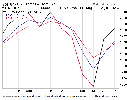
As noted on Twitter earlier today, the S&P 500’s close proximity to its 50-day (blue below) and 200-day (red) along with the “flattish” look of the moving averages tell us the market remains in an indecisive state. Using an extreme example for illustrative purposes, compare the stock market peak in October 2007 (top below) to the present day (bottom).
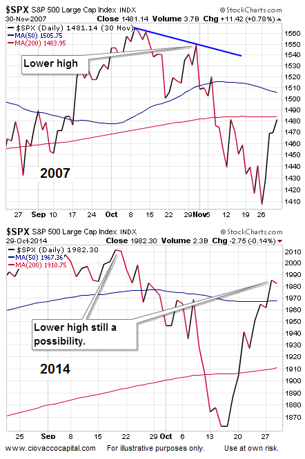
Once the 2014 chart breaks one way or another, we can begin to establish a more slanted allocation, rather than our current mixed allocation of stocks, bonds, and cash. Our current allocation acknowledges the improvement in the evidence, but also accounts for the “stocks have some work left to do” factor. As always, the market, charts, and hard data will guide us if we are willing to pay attention with a flexible, unbiased, and open mind.
Disclosure: None.


