
Is The Market Melting Up? – Weekly Market Outlook
The market may have made progress last week, but in so doing pushed itself back into an overbought condition. Perhaps even more troubling is how all the indices are at or near key technical ceilings, right as the overbought situation developed. Before anyone takes on anything new, a closer look at the potential risks are merited.
We'll take such a look below, but first, let's examine last week's major economic reports.
Economic Calendar
Though last week's economic data dance card was relatively full, as we noted a week ago, not a great deal of the information in the lineup was terribly important. The only items of any real interest were Monday's capacity utilization and industrial production figures, Tuesday's housing starts and building permits, and Tuesday's consumer inflation rate. So, let's limit our focus to those data nuggets to that data.
You might recall that April's industrial activity data showed a mild slump…. not a dramatic one, but a mild one. Though both data sets were still in longer-term uptrends, all big trends start as small ones, and there was a chance April's stumble was the beginning of something more significant. Well, good news – it wasn't. In May, Industrial Production was up 0.6%, and Capacity Utilization ticked higher, from 78.9% to 79.1%. One month doesn't make a trend, but the long-term uptrend was, and still is, pointed in an upward direction. This is a good sign for the long-term market, though it won't stave off short-term pullback.
Industrial Productivity Index and Capacity Utilization Chart
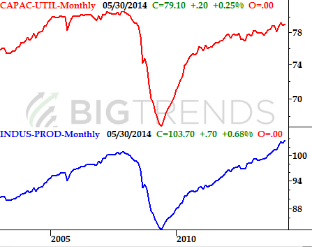
Source: Federal Reserve
As for housing starts and building permits, both fell. Starts fell from an annual pace of 1.071 million to 1.001 million, while new permits fell from 1.059 million 991K. Were it the first time we've seen trouble from these numbers, it might be dismissible. This isn't the first time we've seen trouble here, however. Housing starts and building permits have been slowing – though still growing – since early 2013.
Real Estate Construction Trends Chart
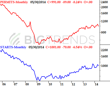
Source: Census Bureau
Finally, while inflation rates started to push higher in April to reach 1.96%, there was some holdout of hope that it might have just been a blip. It wasn't. For May, consumer inflation hit 2.13%… the highest reading since October of 2012. While still not at stifling levels, one has to wonder if this is the beginning of "the big one" that was spurred by years and years of stimulus that should have sparked inflation but never did. We'll have to wait and see, but this is a little alarming.
Inflation History Chart
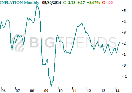
Source: Department of Labor
Everything else is on the table below:
Economic Calendar
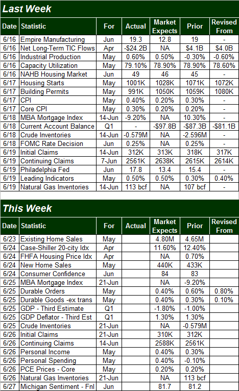
Source: Briefing.com
The coming week is going to round out May's real estate data we started to examine last week. We'll hear existing home sales on Monday, and new home prices on Tuesday (from two sources), along with new home sales on Tuesday. The expected numbers are mixed, though nobody seems to expect dramatic changes either way. As the chart below shows us, sales have been fading for a while, though the home price picture remains mixed.
Real Estate Sales and Price Trends Chart
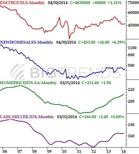
Source: Standard & Poors, Census Bureau, and National Assn. of Realtors
It's also going to be a big week on the sentiment front. We'll get the Conference Board's consumer confidence figure for June on Tuesday, and we'll get the final score for the Michigan Sentiment Index for June on Friday. The pros say the Conference Board's score should edge a little higher, from 83 to 84. Meanwhile, forecasters are expecting the Michigan Sentiment Index to move from a final reading of 81.2 in May to a final score of 82.5 for June. Both data sets were already in uptrends, and those uptrends should be extended this coming week.
Consumer Sentiment Trends Chart
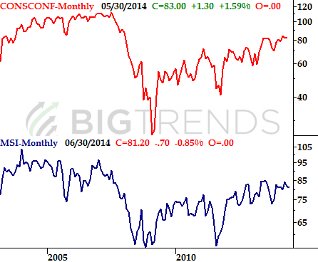
Source: Conference Board and Reuters
Finally, we're also going to hear the final read on Q1's GDP change. It's likely to be even worse than first expected. The prior guess was for a 1.0% dip, but now the pros expect Q1s GDP to have declined 1.8%.
Stock Market Index Analysis
Just to put things in the proper perspective before picking apart any index charts, know that "the bet" here is choosing between an assumption that the euphoria-based momentum will last and the possibility that the overbought market will finally crumble under the weight of recent gains. The most plausible outcome, however, is probably a little more upside before seeing more than just a little downside.
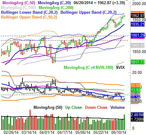
Yes, the momentum is attractive. It may even constitute a meltup. If that's the case, then logic, valuation, and reason are thrown out the window as there's no way of knowing where the mania will end. The more plausible outcome here, however, is at least a small retreat once the S&P 500 (SPX) (SPY) hits a key ceiling. That ceiling is 1969, where the upper 20-day and 50-day Bollinger bands have converged.
S&P 500 & VIX – Daily Chart
All charts created with TradeStation
The meltup scenario's ceiling is the 2000 level. The market loves to use big round numbers as floors and ceilings, and a move to the 2000 mark would mean the S&P 500 has rallied nearly 7% since mid-May… enough of a rally to get the would-be profit-takers thinking. In other words, if 1969 fails to cap the rally, then our target becomes 2000. Between the two potential outcomes though, a pullback from 1969 (or maybe even before hitting 1969) is the more plausible possibility. The CBOE Volatility Index (VIX) (VXX) is wickedly low right now, and even if the VIX's plunge was the result of last week's triple-witching expiration, it's still a condition that needs to be resolved.
That being said, as frothy as things are here, we'll also be looking for any major reversal bar as a cue the selling has begun.
The good news is, there's a lot of support around 1900 now; any dip has a good chance at being halted there.
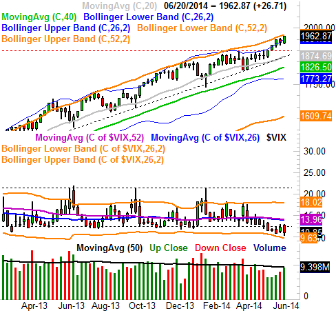
Nothing changes when we zoom out to a weekly chart of the S&P 500, though this timeframe offers some perspective on how low the VIX is now. On the other hand, the market's broad uptrend is also clear here. Even if the 1900 level fails to act as a floor, there's another one waiting at 1882 (and rising).
S&P 500 & VIX – Weekly Chart
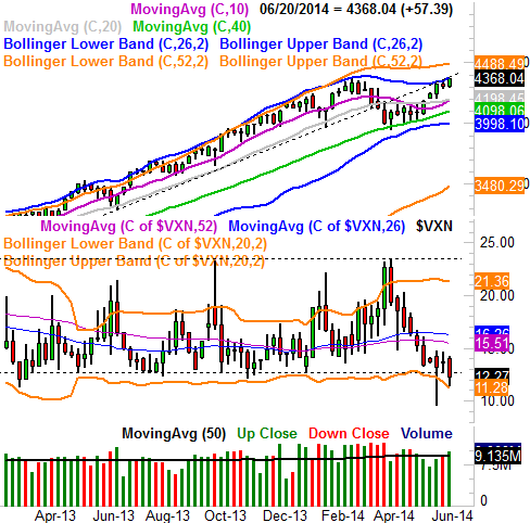
A look at the chart of the NASDAQ Composite (COMP) (QQQ) doesn't look terribly bullish either. On the weekly chart we can see the composite has bumped into its upper 26-week Bollinger band. We can also see how unusually low the VXN has gotten, and it's not just because of last week's expiration. The Nasdaq Volatility Index (VXN), like the VIX, has been creeping to "too low" levels for weeks, and is now dangerously low.
NASDAQ Composite & VXN – Weekly Chart
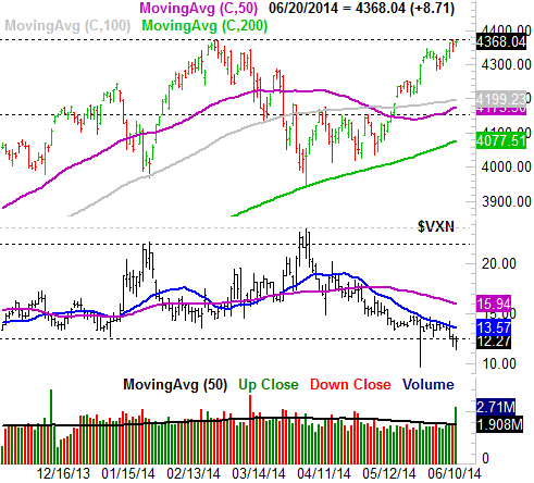
Zooming into the daily chart of the NASDAQ Composite, we can see another near-term problem – the index has once again stalled at 4372, like it did in early March. There may be a major line in the sand there the bulls aren't ready to cross.
NASDAQ Composite & VXN - Daily Chart
Given the limited upside left to tap against a backdrop of a potential move lower in the very near future, this is a situation where any would-be newcomers may want to wait for the inevitable dip to play out. Even a so-called meltup from here wouldn't be very rewarding before it flamed out. And, any tumble could be too big to simply ride out.
Trade Well,
Price Headley
None.


