
October 2014 ADP Job Growth At 230,000, Large Business Growth Was Very Soft
ADP reported non-farm private jobs growth at 230,000. This should be again be considered a strong report. The internals were interesting this month as large business job growth was soft.

- The market expected 200K to 240K (consensus 230K) versus the 230K reported. These numbers are all seasonally adjusted.
- In Econintersect’s October 2014 economic forecast released in late September, we estimated non-farm payroll growth at 170,000 (unadjusted based on economic potential) and 230,000 (fudged based on current overrun of economic potential).
- This month, ADP’s analysis is that small and medium sized business created 98% of all jobs;
- Manufacturing jobs expanded.
- 79% of the jobs growth came from the service sector;
- September report (last month), which reported job gains of 213,000 was revised up slightly to 225,000.
- The three month rolling average of job growth rate was statistically unchanged this month.
ADP changed their methodology starting with their October 2012 report, and ADP's real time estimates are currently better than the BLS.
Per Mark Zandi, chief economist of Moody’s Analytics:
The job market is steadily picking up pace. Job growth is strong and broad-based across industries and company sizes. At this pace of job growth unemployment and underemployment is quickly declining. The job market will soon be tight enough to support a meaningful acceleration in wage growth.”
Per Carlos A. Rodriguez, president and chief executive officer of ADP:
Employment continues to trend upward as we begin the last quarter of 2014, driven mostly by small to mid-sized companies. October’s job growth is the highest since June and the second highest gain of 2014.
Jobs growth of 150,000 or more is calculated by Econintersect to the minimum jobs growth to support population growth (see caveats below). The graph below shows ADP employment gains by month. A graph in the caveats section below compares ADP employment to BLS.

Employment is a rear view indicator, and looking at this ADP data – the overall trend for the year-over-year rate of growth has been flat since mid-2010. (red line in graph below). The year-over-year jobs growth this month is 2.2% with a growth rate statistically unchanged month-over-month.
ADP Non-Farm Private Employment – Total (blue line) and Year-over-Year Change (red line)

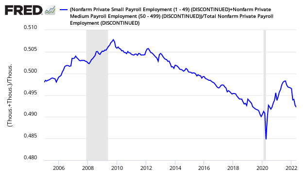
Small and medium sized business historically create most of the new jobs (analysis here) when using the ADP data. A continuing take from the ADP data is that small and medium size business continue to be the employment driver. However, the BLS totally disagrees (see caveats below). The current ADP methodology is showing more jobs growth in big business (and therefore less in small business). Likely they are slowly correcting their data base.
Ratio of ADP Under 500 person Business Growth to Total Business Growth
The relative strength is in the service sector which has driven the jobs growth in 2012 and 2013.

The graph below breaks down employment growth by size of company.
ADP Non-Farm Private Jobs Growth Per Month – Under 50 employees (blue line), under 500 employees (red line), 500 and up employees (orange line)
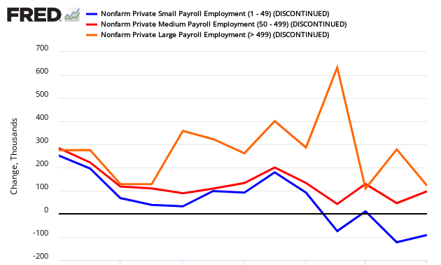
This month small and medium sized business created the majority of the jobs.

Finally, this is a breakdown by sector of contribution this month to employment.


Caveats on the Use of ADP Employment Data
Historically employment is the confirmation that real economic growth is occurring. As background, many economic factors impact jobs growth. How many jobs businesses create in any one month is not directly dependent on these economic factors, but on individual decisions. The impact of all the economic factors is averaged out over many months.
Here is the revised methodology beginning with the October 2012 data:
Working in close collaboration with Moody’s Analytics, Inc. and its experienced team of labor market researchers, the ADP Research Institute has further enhanced the monthly ADP National Employment Report® in order to more closely align it with the final print of the U.S. Bureau of Labor Statistics (BLS) numbers.
Beginning with its November 1, 2012 report, the ADP National Employment Report’s new methodology now utilizes ADP payroll data, U.S. BLS employment data, and the Philadelphia Federal Reserve Bank’s Aruoba-Diebold-Scotti Business Conditions Index.
In addition, the sample size of the ADP data set from which the newly enhanced ADP National Employment Report is derived has been expanded from 344,000 U.S. companies to 406,000, and from 21 million employees to 23 million, which accounts for more than 20 percent of all U.S. private sector employees. This larger data set is expected to help enable the ADP National Employment Report to more closely match the final print of the BLS numbers.
According to the new methodology, Moody’s Analytics’ monthly analysis for the ADP National Employment Report begins with processing ADP data according to the following steps:
- Classification by industry and size class based on the North American Industrial Classification system (NAICS)
- Creation of matched pairs for employment during the pay period including the 12th of the month
- Seasonal adjustment
- Removal of outliers
- Adjustments are made to match the industry and size distribution to the Quarterly Census of Employment and Wages (QCEW) industry and size data reported each March
- Regressions are run to predict the current month’s BLS number by industry
- These are then aggregated to derive the growth in total nonfarm private employment
- Industry, size and total growth rate estimates are then converted into differences.
Additional information about Moody’s Analytics’ methodology can be found at ADPEmploymentReport.com.
Basically this employment index is designed to mimic BLS private non-farm employment – which does not include government employment. The headline BLS Employment Report includes government employment.
Econintersect believes the simplistic sampling extrapolation technique of ADP yields a far better picture of the employment situation in real time than Bureau of Labor Statistics (BLS) methodology. Although the BLS employment numbers eventually are correct, their data gathering technique does not support the quick release schedule.
Because of the differences in methodology, many pundits ignore the ADP numbers. Although there can be a low correlation in a particular month, the different methodologies tend to balance out, and the correlations are excellent outside of the data turning points. We are now 22 months past the post recession turning point in employment. Based on current estimates, BLS non-farm private jobs growth in 2011 was 1,920,000 while ADP was 1,925,000. The difference is insignificant. The graph below shows ADP’s monthly change (blue line) versus BLS non-farm private change (red line).
ADP versus BLS – Monthly Jobs Growth Comparison

There is now a known disconnect between BLS and ADP on the breakdown of jobs growth between small, medium and large business – as the graphs below illustrate. Basically the BLS sees large business as the employment driver, while ADP sees small and medium size business as the employment driver. For full details please read: BLS Experiments With New Data Series: Now I Am Confused.
Comparing Jobs Growth Per Month – ADP vs BLS


There is the proverbial question on what is minimal jobs growth each month required to allow for new entrants to the market. Depending on mindset, this answer varies. According to Investopdia, the number is between 100,000 and 150,000. The Wall Street Journal is citing 125K. Mark Zandi said 150K. Econintersect is going with Mark Zandi’s number:
- If Econintersect used employment / population ratios to determine the number, the exact number seems to be between 140,000 and 160,000. The graph below uses the historical employment-population ratios to show jobs growth per month if the population was 300 million.
Historical Monthly Jobs Growth Comparison if Population was 300 Million

- If Econintersect uses employment – population ratios, the correct number would be the number where this ratio improved. Using the graph below, the ratio began to improve starting a little after mid-year. This corresponds to the period where the 12 month rolling average of job gains hit 150,000.
Employment to Population Ratio
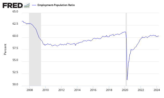
Note: The ratio could be fine tuned by adjusting to the ratio of employment to working age population rather than the total population. However, this would not change the big picture that an increase of somewhere around 150,000 (+/-) is needed for the growing population numbers. We have estimated 140k – 160k. The number might possibly be within the range 125k – 175k. Econintersect cannot find reason to support the estimates below 125k.
The question of how changing demographics impact the employment numbers is at the margins of analysis. Econintersect will publish more on this fine tuning going forward, both in-house research and the work of others.
The following graph (not seasonally adjusted non-farm private payroll) shows that most of the employment growth are in the first half of the year, and there is little real growth of employment in the second half of the year. Therefore seasonal adjustment algorithms understate employment growth in the first half of the year, and overstate growth in the second half of the year.
Non-Seasonally Adjusted Employment – Private Sector
Disclosure: None.


