
Profiting From Market Volatility And Some Institutional Insight

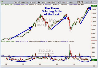
The persistently low market volatility has been an unending source of discussion for analysts, pundits and traders. And rightfully so — the low volatility environment that is a major characteristic of grinding bull markets (mid-1990s, 2003–2007, and late 2011–present; see chart below) has not only changed the trading strategies for options writers but has also given equities traders a seeming carte blanche to pile into the markets.
The sometimes wacky, sometimes useful Business Insiders website has just put out its “Most Important Charts” roundup, where serious analysts and a few traders send in their contributions. Not surprisingly, low volatility visuals often show up along with Chinese debt & housing, Fed QE explanations and several on the U.S. housing market and employment picture. I’ve included a couple of my favorites below (yes I did slog through all 91 charts for you loyal readers…!).
2014 Market Performance VS. Implied Volatility Forecast
First up is a chart that I found interesting because it shows, in a very useable format, a visual interpretation of implied volatility. Implied volatility is a mathematical forecast of price’s future variability. In this chart, Jared Woodard, Equity Derivatives Strategist at BGC Partners took the beginning-of-the-year price projections from a group of analysts for each of the past four years and projected them out as pink parabolic cones. These cones represent the implied range based on options prices at the beginning of the year:

A few observations:
This year’s market movement so far has been well within the implied range.
There is some upside still available along with some significant downside possible.
We’ve already exceeded the 14 analysts’ median target for the year.
Last year, the market showed true outperformance.
Even the huge drop in 2011 when U.S. debt was downgraded amid the early stages of the European debt crisis was contained within this definition of implied annual range.
Small Caps & Large Caps Volatility Ratio
In our last chart (below) you can see the ratio of the Russell 2000 Volatility Index divided by the S&P 500 Volatility Index. The chart shows the 30-day implied volatility between small cap and large cap stocks. David Marquart, Portfolio Manager at Quad Capital contributed this chart and note that it ends right on July 17th. The Malaysian airliner was tragically shot down earlier that day over eastern Ukraine which sent equity prices down across the board. The ratio is significantly lower now at 1.475, though still in the upper end of the range:

Observations:
Marquart interprets this divergence as a shift in risk sentiment from higher-beta assets.
His second insight is that this chart highlights the correlation opportunities that volatility traders look to exploit until implied volatilities begin to realize historical levels again.
Both of these are very astute interpretations; remember that implied volatility goes up as price goes down. This means the Russell has retreated significantly from its record highs while the S&P has not…
Insights from an Institutional Trading Desk
Here are a few closing thoughts on a lesser known aspect of volatility. An institutional trading desk that we work with told us that the implied volatility skew is at the highest levels seen since the real estate / credit bubble burst.
Volatility skew is the difference between the price for out-of-the-money (OTM) puts vs. OTM calls. Since the 1987 Black Monday crash, this skew has been persistent and significant but the trading desk reports that the skew on the S&P 500 is currently at an extreme. That is, puts are very expensive and calls are relatively cheap. A primary impact on institutional investors is that the buy-write strategy (where a firm sells or “writes” a call option to produce income and hedge the position) has dwindled to almost nothing.
The trading desk manager cautioned us that volatility really is creeping into the market but not showing up in traditional VIX calculations. All investors and traders should heed this warning.
Disclosure: None.


