
Reading Macro Data: Growth Rates, Annual Rates, Data Breaks
Newcomers to macro often encounter problems in interpreting and using data. The first is how to report growth rates, particularly when trying to assess the current state of the economy. The second is how to read data reported at annual vs. quarterly vs. monthly rates. The third is accounting for the presence of breaks in data collection. (This post primarily for students in Econ 435 and Public Affairs 854.)
Growth Rates
Suppose one wants to report annual growth rates, but one has a choice between using annual data or quarterly data. One convention applied to quarterly data is to use 4q/4q, that is the growth rate from the previous year’s 4th quarter to the current year’s. This calculation sometimes leads to similar growth rates, but sometimes does not. Consider a comparison of the years around the last recession.
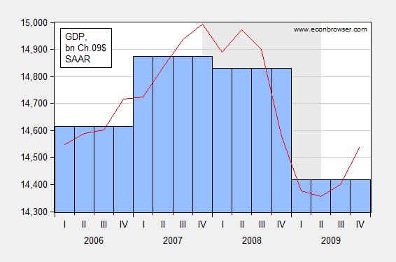
Figure 1: Annual GDP (blue bar), and quarterly GDP SAAR (red line), in bn. Ch.2009$, 2006-2009. Source: BEA.
The growth rate in 2008 using annual data is -0.29%, which seems like a modest decline. The 4q/4q change in 2008 was 2.77% (and the 2009Q4 q/q annualized growth rate was -8.35%). Which calculation is correct? Neither — it depends on what the question is. However, if one were looking at the data in early 2009, one would probably want the most recent reading on GDP growth; hence a q4/q4 reading is probably more useful in this case.
Another way to look at this is that the year-on-year calculation is approximating a growth rate calculated from the middle of the previous year to the middle of the current year. Figure 2 shows the growth rates calculated using year-on-year annual data (blue), 4q/4q using quarterly data (red), and the 4 quarter change in the average of Q2 and Q3 GDP (green).
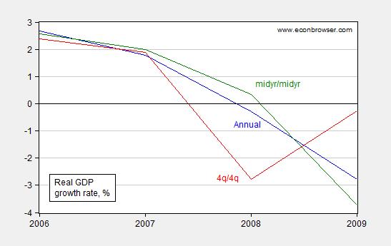
Figure 2: Real GDP growth rates calculated using year-on-year annual data (blue line), 4q/4q using quarterly data (red line), and the 4 quarter change in the average of Q2 and Q3 GDP (green line), in %. Source: BEA and author’s calculations.
Bottom line: Year-on-year annual growth rates are essentially measuring the growth rates assessed from the middle of the year.
Annualized and Non-annualized Rates
Oftentimes, one sees the term SAAR ascribed to a data series; this acronym stands for Seasonally Adjusted at Annual Rates. Typical US government macro aggregates are typically reported at annual rates — for instance the GDP levels (red line) reported in Figure 1 are at an annual rate — that is the figure if the level of GDP that would obtain if that rate of spending in that quarter continued for an entire year.
This is something that even University of Chicago macroeconomists can make mistakes with. As I pointed out at the time, if one is calculating a multiplier as the change in GDP for a given dollar amount of stimulus (ΔY/ΔG), for instance, one has to remember the GDP figure is reported atannual rates, while the stimulus figure was (in this case) reported at a quarterly rate. Paul Krugman also noted that if one forgets that growth rates (in the US) are typically reported at annualized rates, one can make a compoundingly embarrassing error.
Just to confuse matters, not all US government series are reported at annual rates; some are not. For instance quarterly Balance of Payments data in the international transactions release are reported at quarterly rates; monthly data in the trade release are reported at monthly rates.
And once one starts looking at foreign data, one has to be particularly attentive; quarterly GDP level and growth rates are typically reported at quarterly rates.
Data Breaks
As government and international statistical agencies collect data, the mode of the data collection or the means of calculation sometimes change. Those changes are usually noted, but if one does not make reference to the documentation, one can make serious mistakes. For instance, examining civilian employment (FRED series CE16OV), one would think there was a tremendous boom in employment in January 2000.
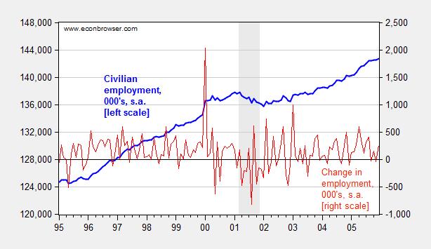
Figure 3: Civilian employment (blue, left scale) and change in civilian employment (red, right scale), both in 000’s, seasonally adjusted. Source: FRED series CE16OV.
If one inspects other series, say nonfarm payroll employment, one sees no corresponding jump. This suggests the boom interpretation is wrong. Further evidence of a “break” is found by inspecting the first difference of the series (in red). The spike in January 2000 is a 1.5% change (m/m), while the the standard deviation of changes is 0.3% (calculations in log terms).
In fact, the jump is due to the introduction of new population controls associated with the Census. New controls are applied every decade, so this is a recurring (and known — to those who are careful) problem. Nonetheless, here’s an example of the mistake regarding the participation figure. Other breaks are less obvious. This is a cautionary note to all who download data without consulting the documentation.
Disclosure: None.


